News
Restaurant design: a bold aesthetic and understated sophistication at COY
Tuesday, November 5th, 2024
Multi-award-winning chef Ryan Cole of Eat Out three-star restaurant Salsify at the Roundhouse has opened a new restaurant at the bustling V&A Waterfront in Cape Town.
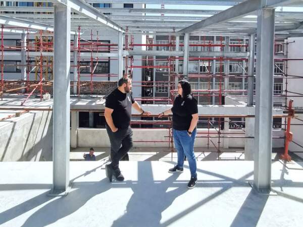
Working with Creative Director Kobus Truter and Senior Interior Designer Tarryn Walbrugh of KT Interior Architectural Studio, a Cape Town-based interior and architectural design studio, Ryan brought his ideas and concept for COY to fruition.
Understated yet striking
Leaning into the catchphrase “hidden in plain sight”, COY is located between two busy precincts, namely the Time Out Market and the Silo. With this in mind, the design approach was led by the concept of curating a ‘hidden gem’.
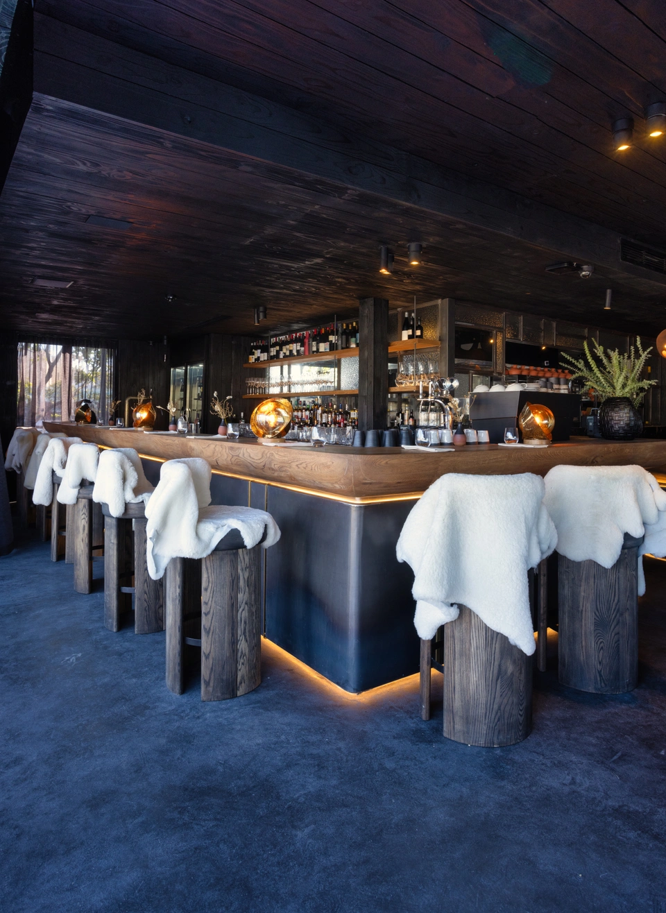
Both the interior and exterior of the restaurant have been given a dark colour palette, ensuring that the focal points for guests while dining are both the refined dishes and the pristine views of the surrounding V&A Waterfront dock and Table Mountain.
The integral structure of the restaurant was built to create a ‘frame’ for the breathtaking vistas. “We went with creating purely black-toned interiors to ensure that the views pop out, somewhat like a picture frame,” shares Kobus.
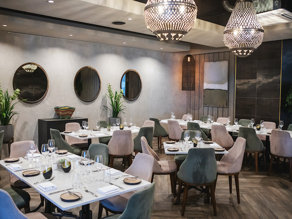
Aptly titled COY, which means shy or unassuming, the restaurant design reflects this in its sleek yet cool interiors and finishings; from the locally produced black and white chairs to the grey curtains and low lighting.
A sensory experience
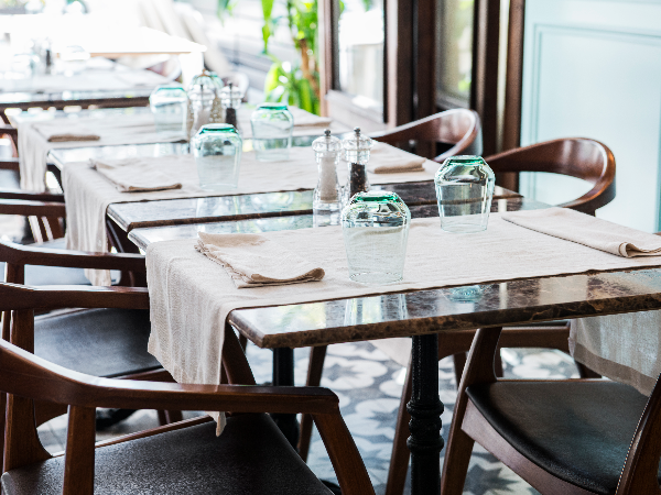
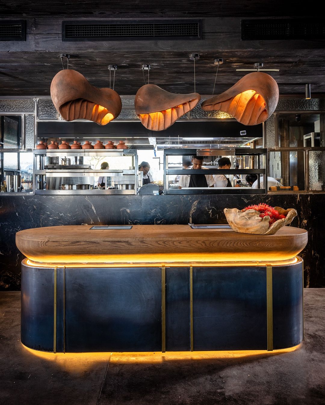
The interiors of the restaurant aim to reflect the continent’s love for texture, applying this to all areas of the restaurant, from the polished floors to the sandblasted bar area and uniquely textured dining tables etched with markings.
“It’s all a modern take on Afro Chic, with a focus on sharing what Africa is [in design terms] and what African cuisine is as well,” points out Tarryn.
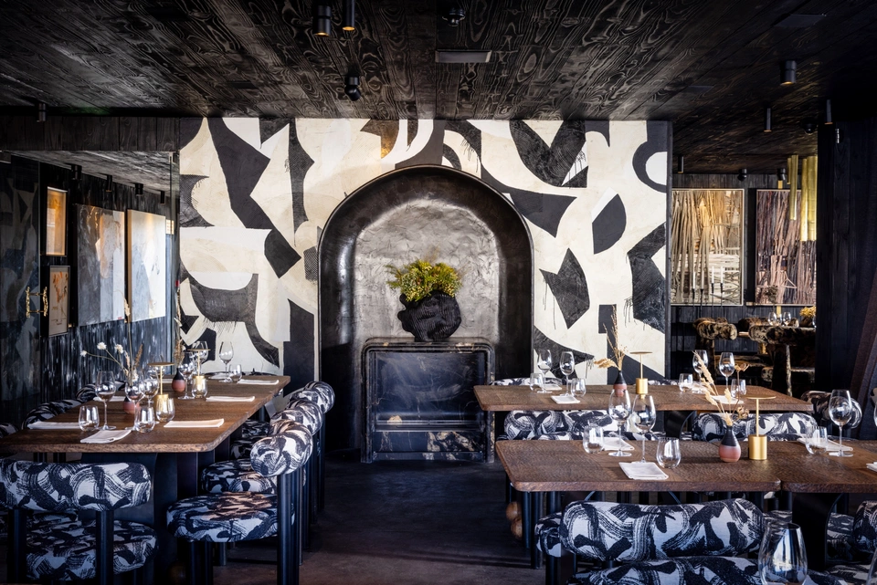
Ryan ensured that the ethos behind the restaurant’s food and drink offering was echoed and woven through all the design elements. This included going local when it came to the furniture. “We had all the furniture pieces designed and manufactured locally by talented artisans,” explains Kobus.
As an ode to the nearby ocean, KT Interior Architecture Studio ensured that the interiors give off a subtle maritime feel. “The lights on the bar filter into a bit of a nautical aesthetic, a slight hint to a lighthouse and the surrounding ocean,” shares Kobus.
Curating a visual feast for guests to savour while they dine on a range of tantalising dishes, the various design elements of the restaurant work in tandem to create a truly sensory-driven experience.
As you walk into the restaurant, you are greeted with artwork that lines the main entrance way, and more art pieces can be seen on the main feature walls of the restaurant. Continuing with the theme of local is best, all artwork featured was sourced on consignment from Everard Read and is by local artists to help celebrate and spotlight their work.
This article first appeared in VISI.
Images: Jan Ras (exterior); KT Interior Architectural Studio (interior)
The next Eat Out Woolworths Restaurant Awards will take place in early 2025 where the Eat Out Style Award will be presented. Stay tuned to Eat Out for further updates!


