News
Magazine teaser: crafting the perfect space to reflect your restaurant’s identity
Tuesday, October 22nd, 2024
Image: Unsplash
It doesn’t matter if you’re a three-star Michelin sensation or the town’s favourite late-night-greasy-treat hole-in- the-wall – the design of your restaurant is as important as the ingredients in your kitchen when it comes to creating a memorable experience. We spoke to Kobus Truter of KT Interior Architectural Studio to get the lowdown on how to create the perfect space for your restaurant’s identity.
Know who you are
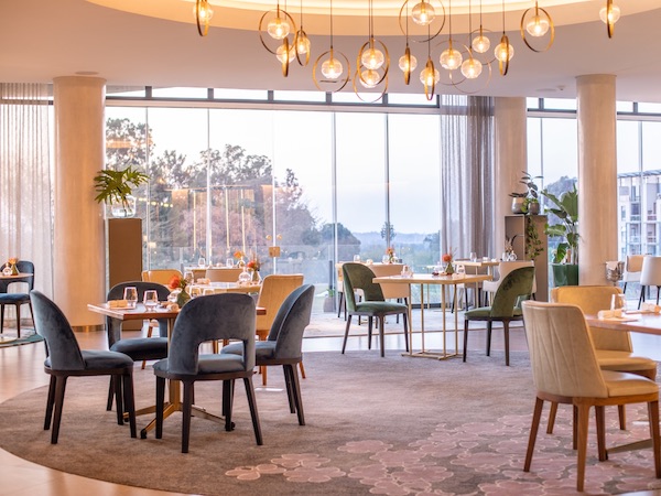
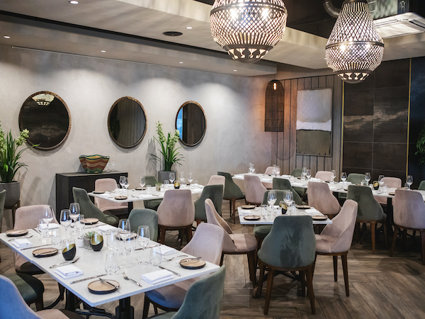
First things first: you have to be sure of the kind of restaurant you want to run, and the kind of experience you want your patrons to have. “Concept is important,” says Kobus. “What and who is the restaurant targeting? Is it a burger joint or a Mexican spot? What is the brand identity? We find it helpful to design with an identity in mind; everything follows from there. In a burger joint, we’ll use playful colours, lights, vibrancy and texture. A seafood restaurant will be light and airy, reminding us of the ocean. For fine dining, we’ll go with more muted tones, so that the focus stays on the food. For example, right now we’re working on a concept with a substantial amount of black, to ensure that the food really pops.” Play with materials and textures Mixing different textures, materials and colours can create a dynamic space that makes diners feel engaged, and that stimulates their eyes and imagination as much as their taste buds. “Many restaurants think they need to spend a fortune on decor, but sometimes it’s as easy as layering,” says Kobus. “We’ll go to nearby florists or antique shops, and find small details such as picture frames for the walls that will make a guest want to spend a few hours in the space.”


