News
5 tips for great restaurant design
Thursday, October 27th, 2016The atmosphere and practicality of a restaurant can make all the difference. But how does one get it right without spending thousands – or investing in the wrong things? We chatted to the experts to find out what’s important.
1. Prioritise
Designing – or redesigning – a restaurant can be a costly exercise, so make sure you focus on what’s important. “The most important aspects to consider in restaurant design are comfortable seating, striking furniture, mood-enhancing lighting and an effective layout,” says Aidan Hart, director of Inhouse Brand Architects, who’ve been involved in many high-profile restaurant designs – most recently Villa 47’s three-storey restaurant empire on Bree Street, Cape Town.

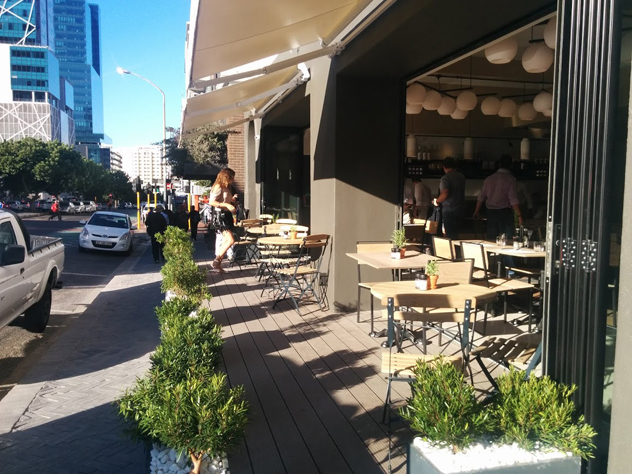
The street-side seating at Locanda at Villa 47 was an instant hit with Capetonians. Photo by Katharine Jacobs.
Irene Kyriacou of Oniroco, who designed magnificent new Rosebank restaurant Marble, says that when planning a design, it’s worth spending your money on the features that are going to have longevity. “It’s worth paying for shop-fitting, furniture and flooring,” she says, as these are the elements that need to last.
2. Sort out the spatial layout first
“Poor spatial layout is a mistake I often notice,” says Aidan. “Guests will feel uncomfortable if they are in close proximity to the kitchen or other patrons. It is imperative that guests have some form of personal space, while still feeling connected to the complete ambiance of the space.”
Think about how waiters will circulate in the space, how the bar will work with the kitchen and whether or not you want customers to order from a waiter – or whether you’re planning on operating a fast-casual self-service system.

The handsome bar at Marble. Photo supplied.
If you’re working with a big space, think about how you can create intimate smaller spaces within. “I love using screens,” says Irene. “They allow you to zone off a section without blocking off the space with a solid wall.”
3. Fix the lighting
Irene says that lighting can make or break a restaurant’s ambiance. “You’ve got to match it to the style of the eatery – whether that’s moody and sexy, festive or casual.” Also pay attention to the details – is there a feature wall that can be illuminated, for instance?

Sunset at Marble. Photo supplied.
Also consider the time of day you’re going to be open. At Villa 47, Stuzzico and Restaurant have more moody lighting, best suited to afternoon drinks or dinner; Locanda – on the ground floor – needed a different treatment. “It is open throughout the day, so we ensured that it was given a light, bright interior,” says Aidan.
4. Find your personality
In an ideal world, a restaurant’s design should express what it’s about. Aidan enjoys working with sustainable wood and other natural elements to represent the ‘slow food’ movement. “I love contrasting these natural elements with industrial-inspired elements, like exposed brick work and concrete.”
Alternatively, it might just be about keeping things classic and subtle, and adding personality with the details. Inhouse also recently designed a Joburg branch of the Piza e Vino chain where there they chose to reflect the Italian theme in an elegant way but added a few tasteful quirks, such as rolling pins and wine barrels.

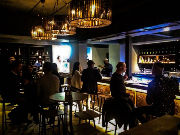
The bar at Stuzzico at Villa 47. Photo supplied.
If you’ve got the budget, you can create an incredible impact with art. “At Marble, we invested in art, and Krisjan Rossouw’s photos and Damian Grivas’s makrami wall make an amazing impact,” says Irene. But if the budget is tight, Irene also recommends shopping around at markets for decorative pieces that add personality.
5. Don’t neglect the acoustics.
The effects of noise pollution on productivity and human health are well-documented and quite startling. Current trends like open kitchens, glass and concrete, though, can create an incredible din – something which will exhaust your staff as well as your customers. At Marble, Irene used Ecophon acoustic board in the alcoves to keep noise levels down in the big space. The team also worked with professionals to position speakers in the correct places and plan the restaurant’s soundscape.

Harissa and pumpkin with green beans and a buttermilk dressing at Marble. Photo supplied.
Need inspiration? Check out this year’s nominees for the Boschendal Style Award here.


